Challenges Faced

Balancing Sentiment with Scalability

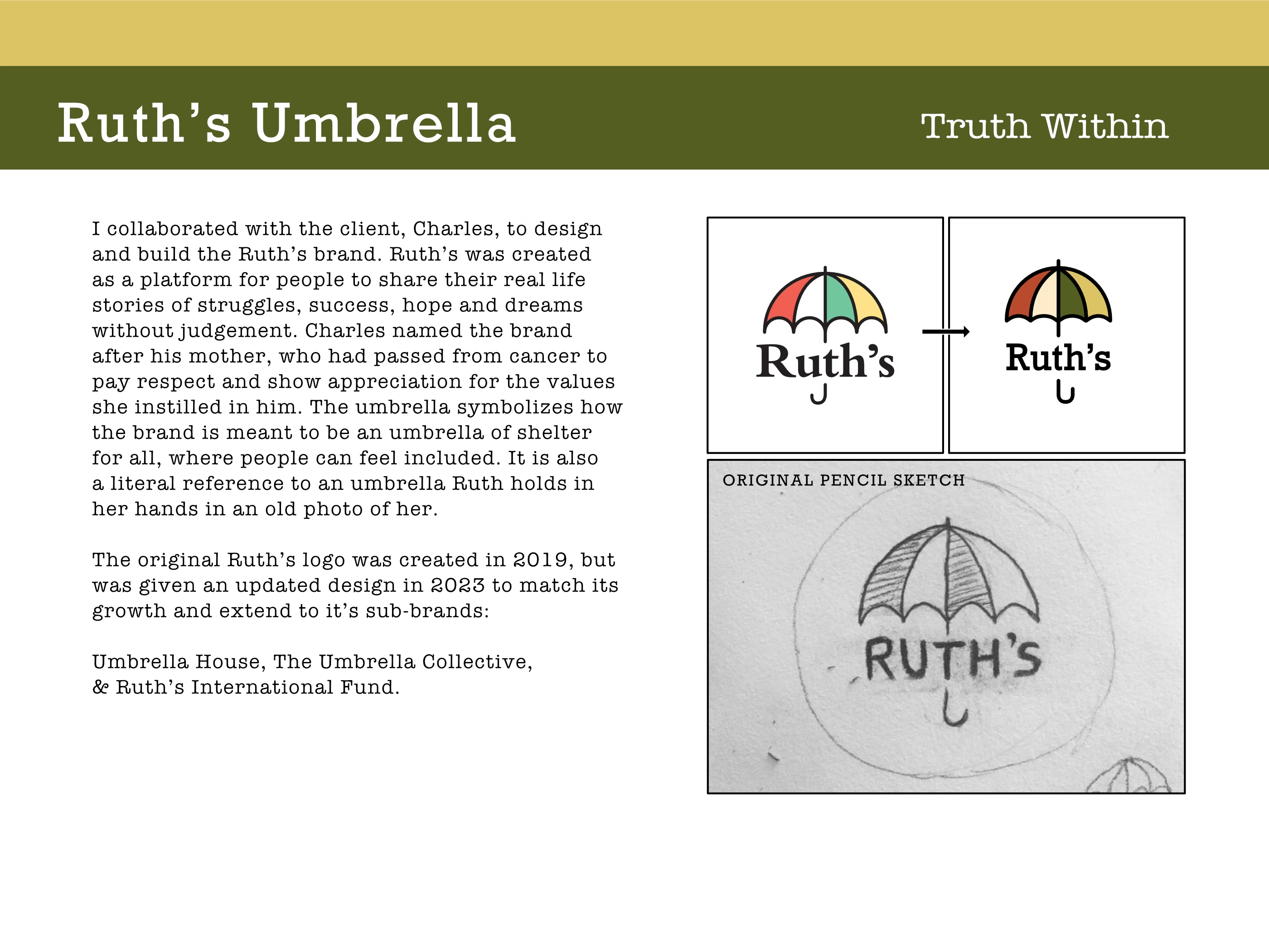
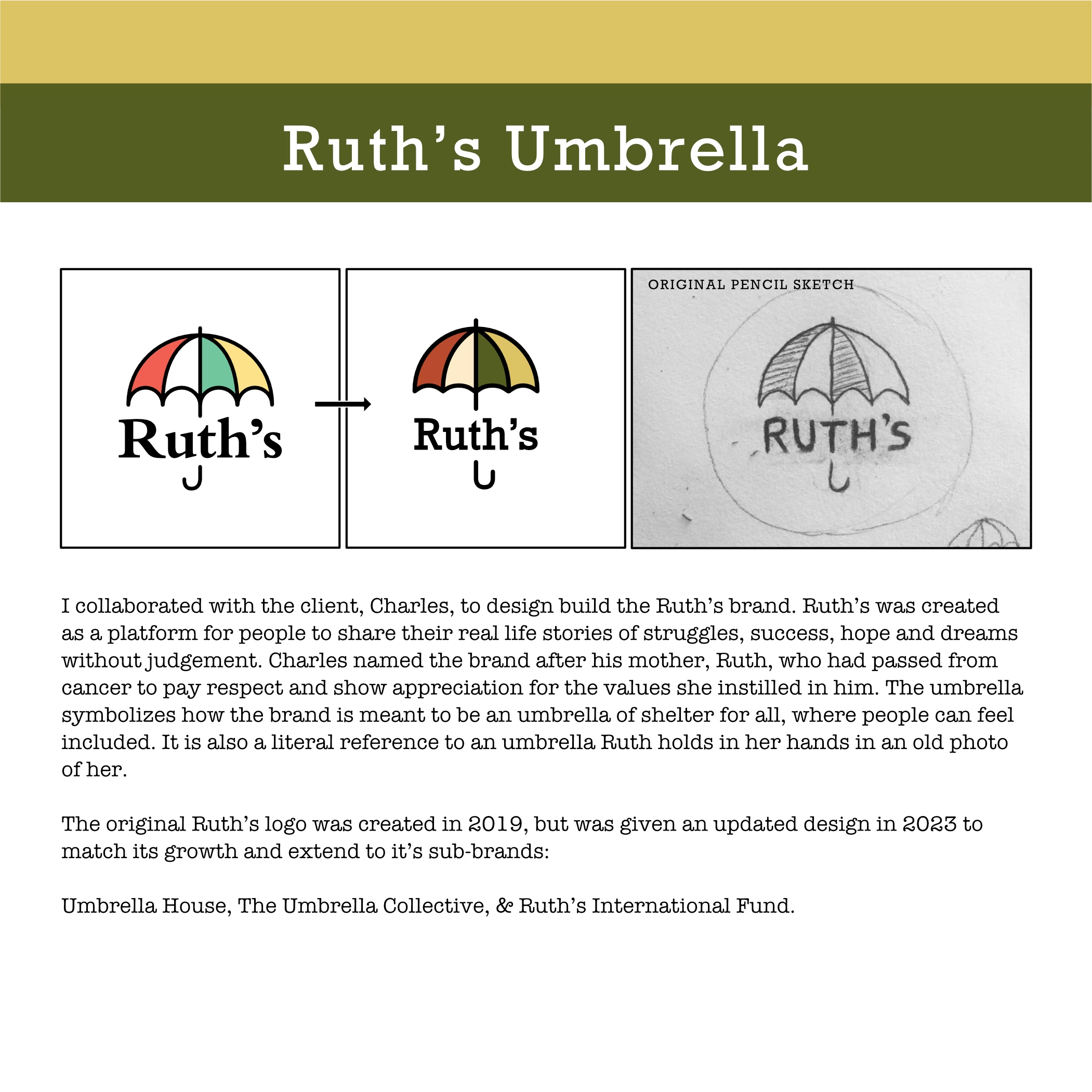
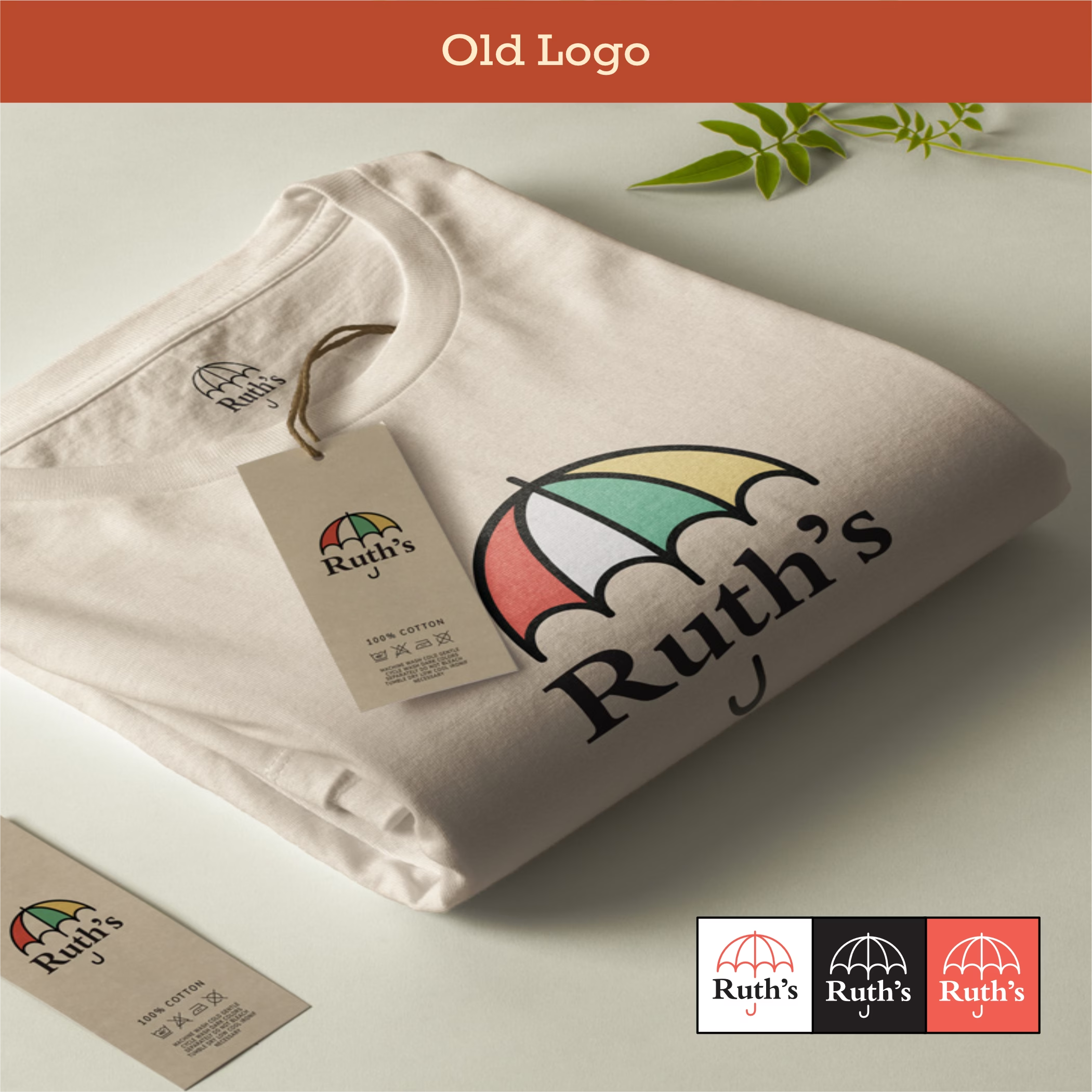
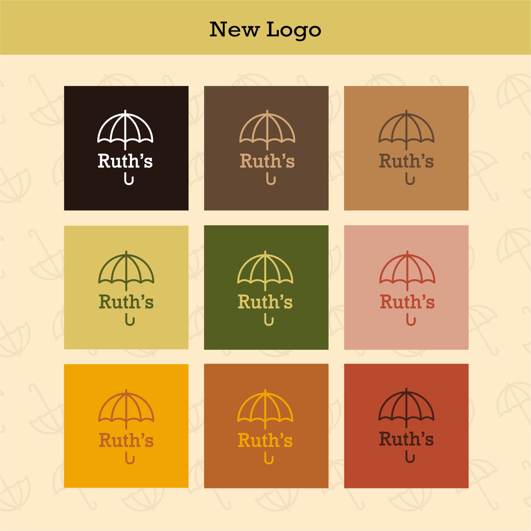
Translating a deeply personal story (named after Charles’ late mother) into a visual identity that’s not only emotional but also versatile enough for sub-brands and broader audiences.

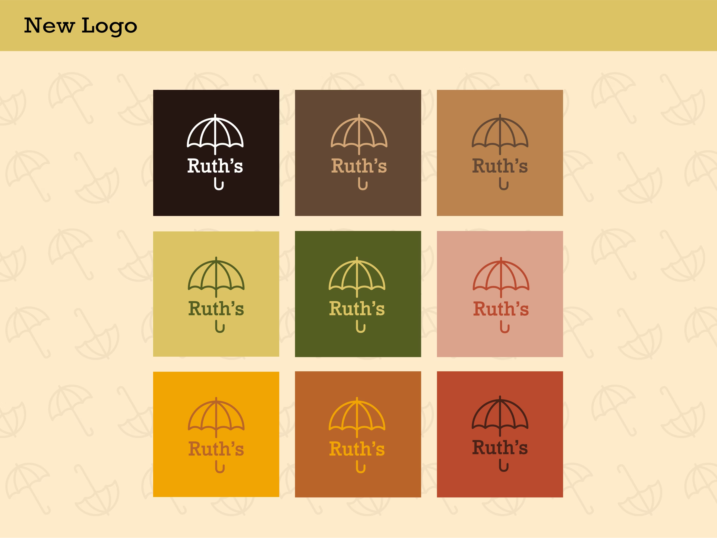
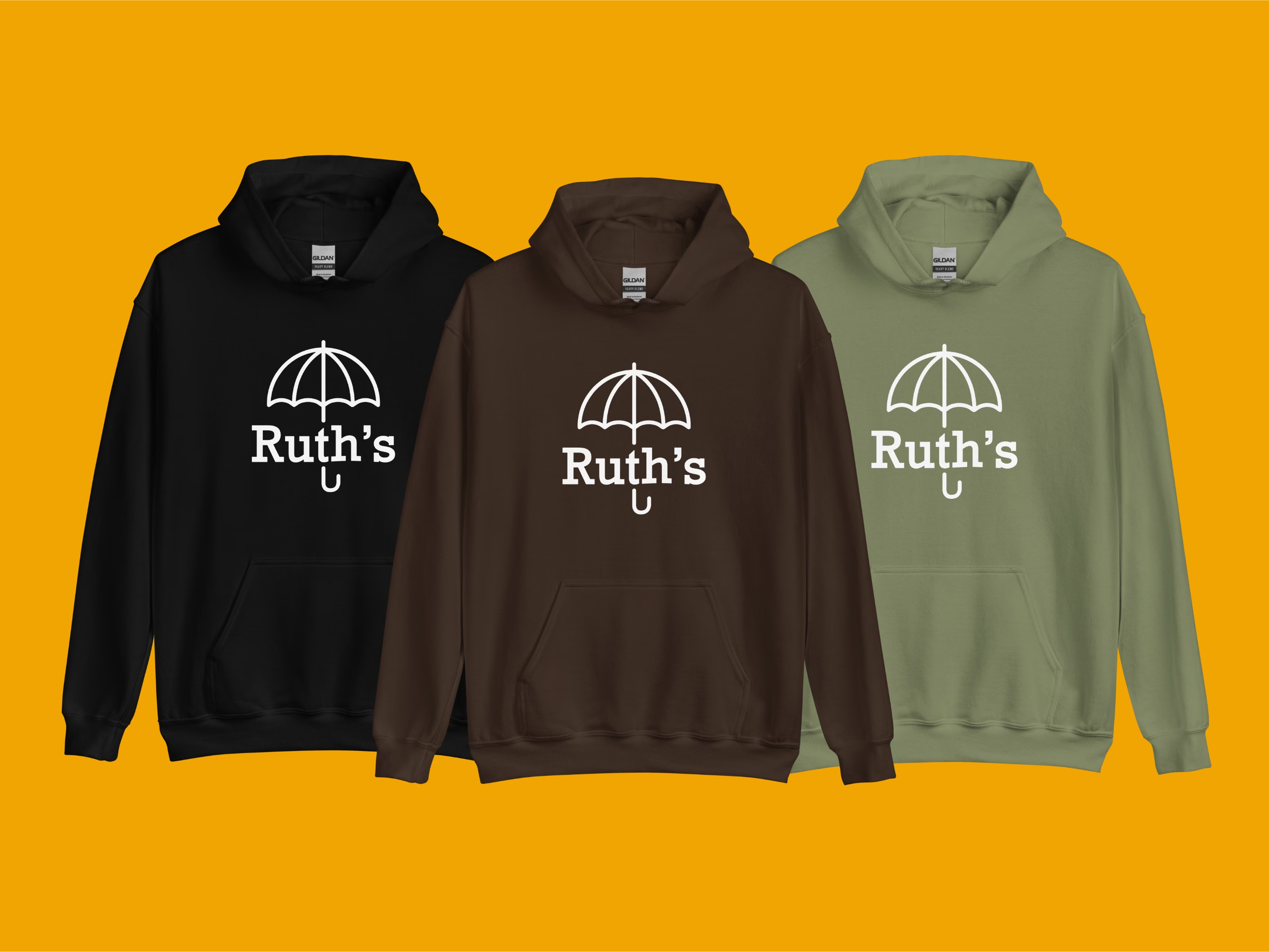
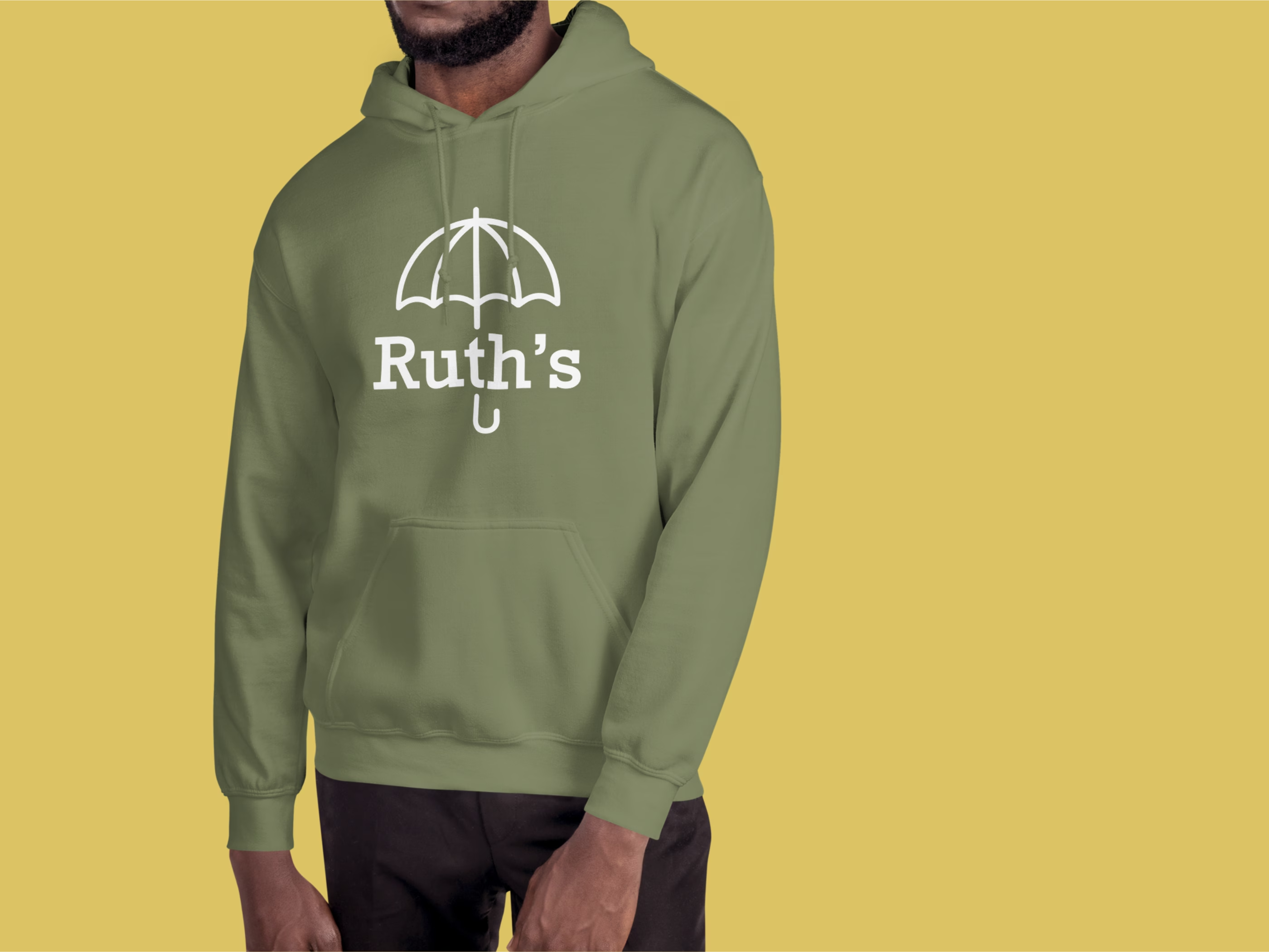
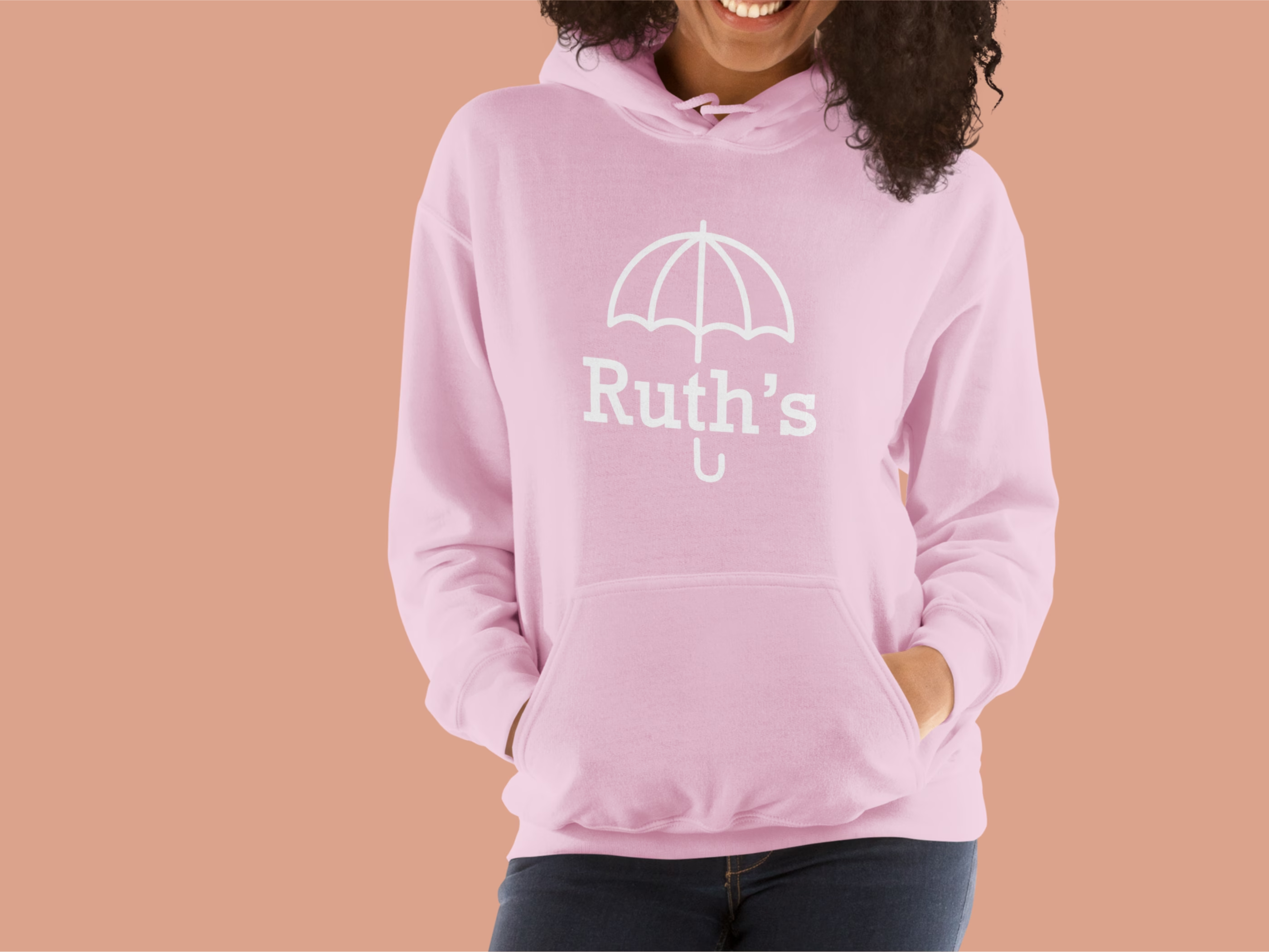
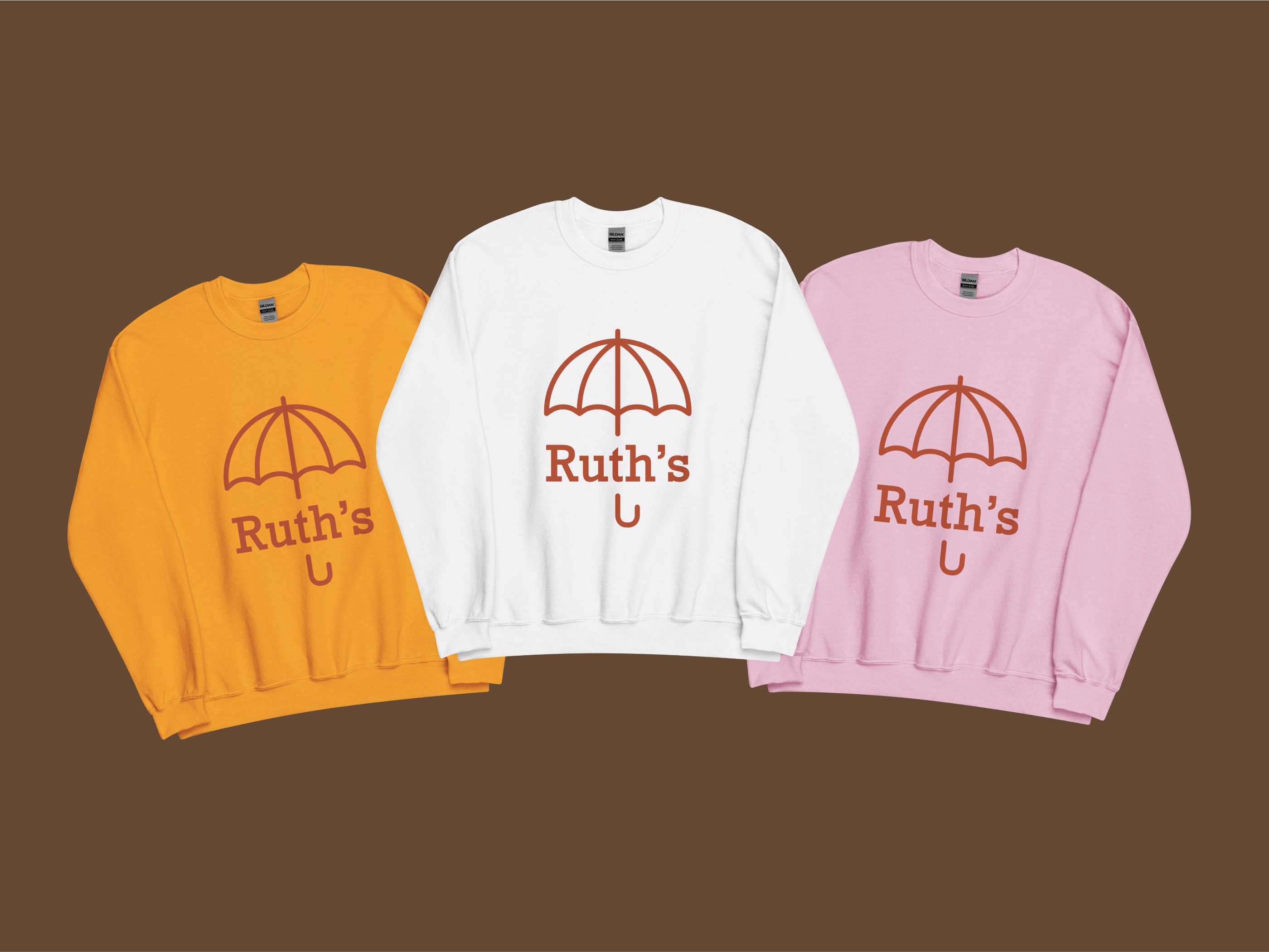
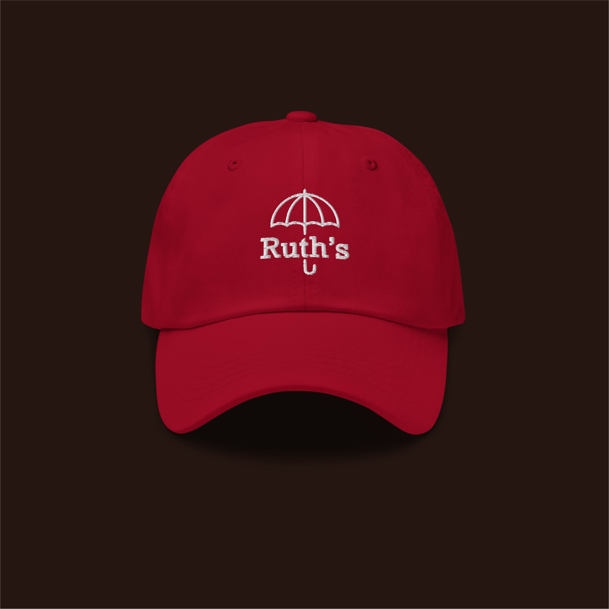
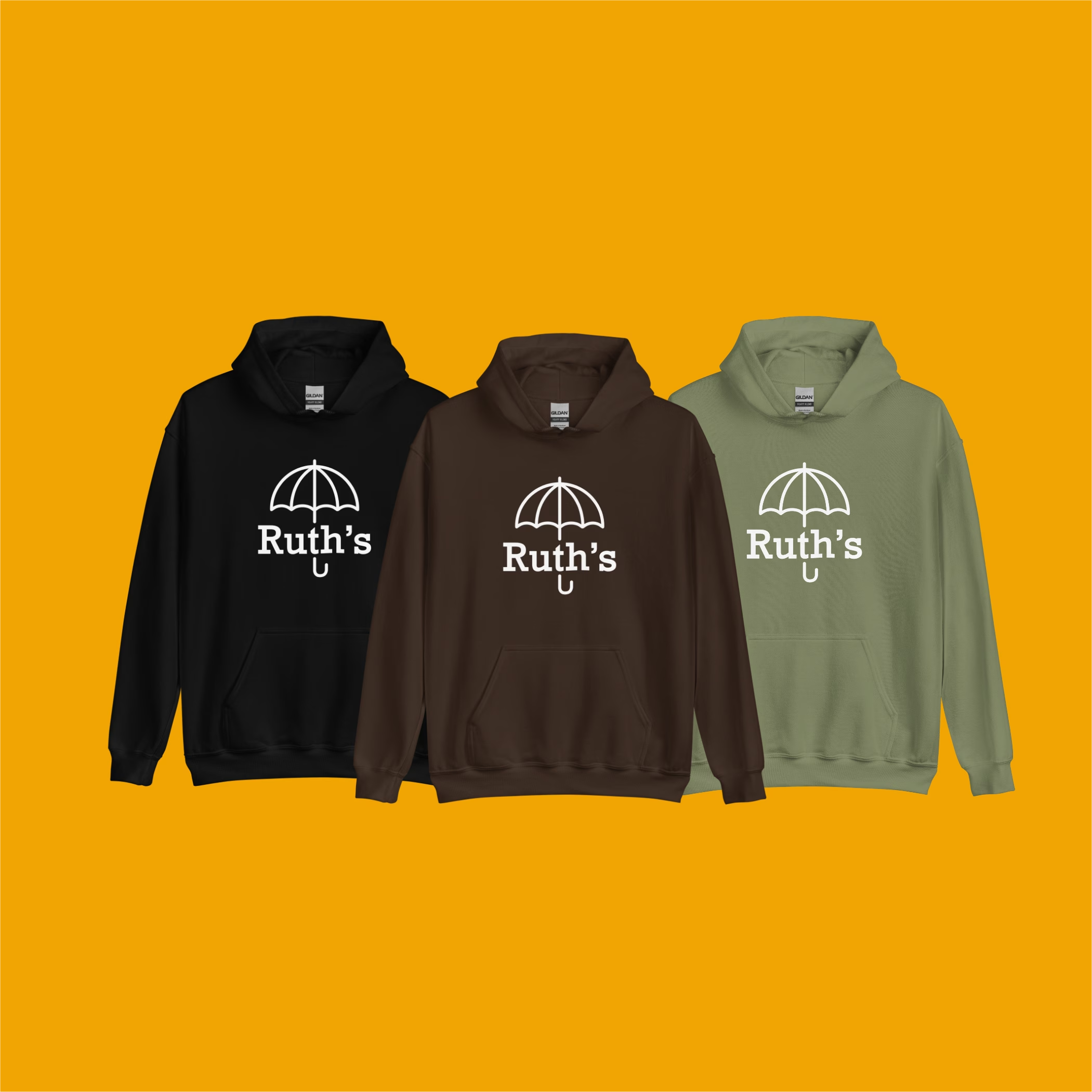
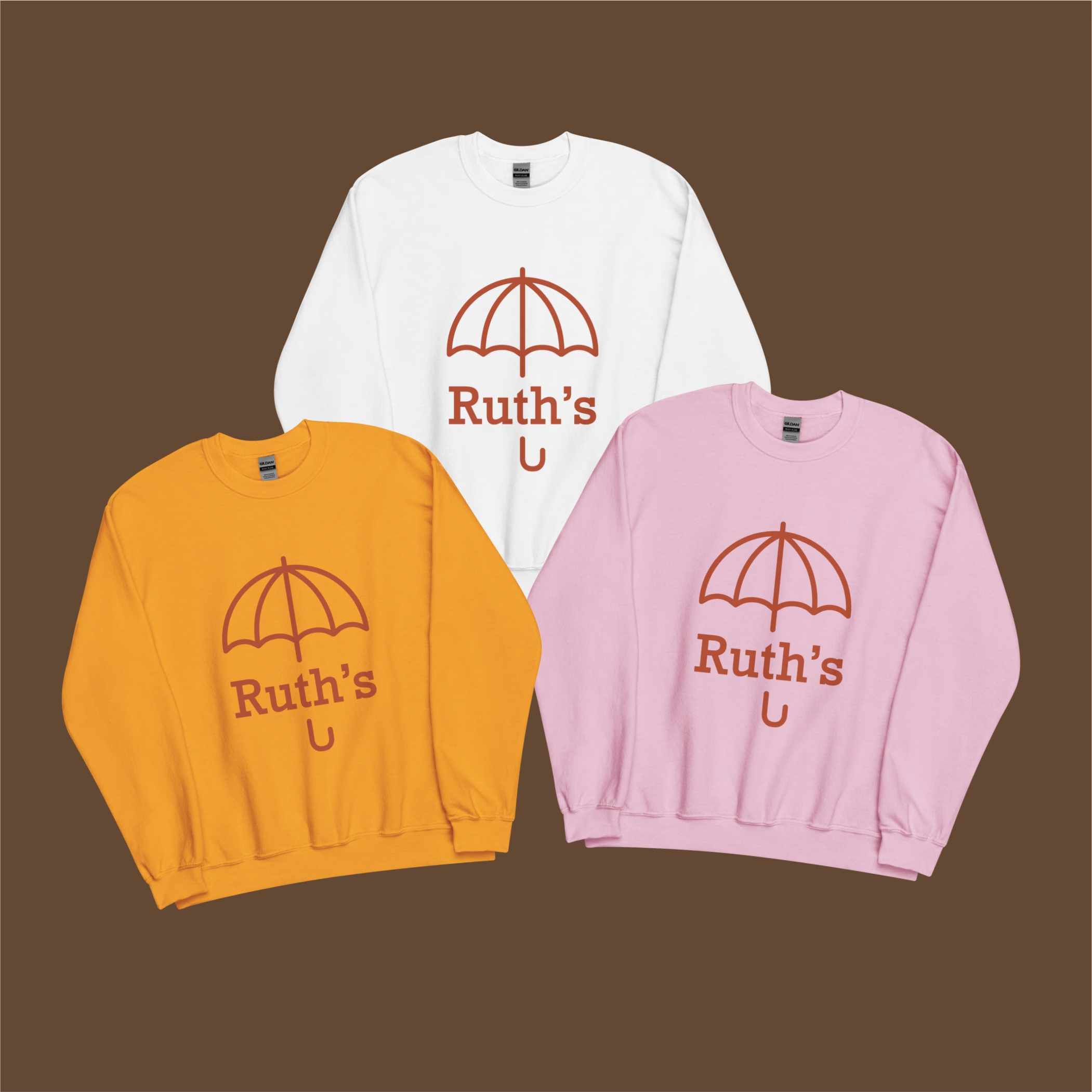
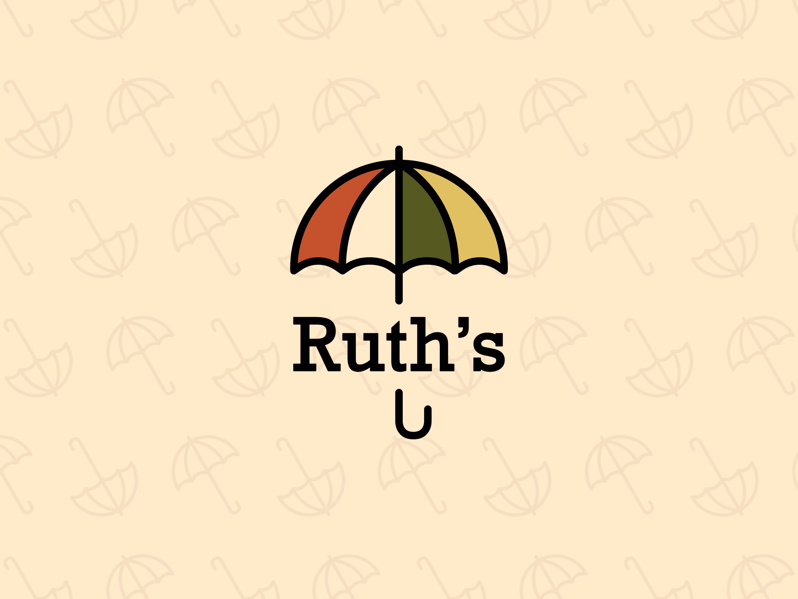
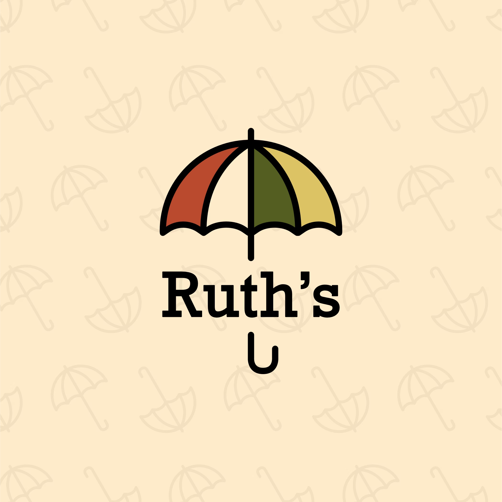
Solution: We crafted an umbrella symbol that’s both a literal artifact (from a photo) and a universal metaphor for protection and inclusion — making it emotionally grounded but expandable for entities like Umbrella House and Ruth’s International Fund.

Evolving the Brand Without Losing its Soul

Updating the 2019 logo to reflect growth without disconnecting from the brand’s original meaning and grassroots feel.

Solution: We simplified and refined the umbrella while preserving the core visual — maintaining recognition and emotional continuity while allowing for professional expansion.

Designing with Empathy for a Vulnerable Audience

Creating a brand for a platform centered around people’s real, often vulnerable stories — requiring extra sensitivity in visual tone, typography, and color.

Solution: We used soft, warm colors, friendly serif typography, and rounded design elements to communicate safety, approachability, and respect, making the brand feel welcoming and non-judgmental.

Enough dreaming, let's start building your vision today.

There's no pressure, just hit the button to submit your project idea and we will get back to you with your project specific details, pricing, timelines and more!